Have you ever looked at a word on your screen and thought, “I wish this font felt a little more like me”?
Designing your own font is one of the most satisfying creative projects you can take on. It mixes drawing, rhythm, spacing, and personality into something people can actually use in logos, posters, social posts, packaging, and websites.
A custom font can also sit nicely beside other design resources like mockups, icons, and even a clean WordPress theme when you want a full visual style that feels consistent.
The best part is that you do not need to make hundreds of fancy letterforms on day one. You can start small, keep things simple, and build your font step by step.
Start With A Clear Idea For Your Font
Before you open any software, take a minute to decide what kind of feeling you want your font to carry. This helps every choice after that feel more natural.
A font can feel playful, calm, bold, soft, neat, or expressive. Once you know the mood, it becomes much easier to shape the letters.
Pick The Job Your Font Will Do
Think about where your font will appear most often.
- Headlines
- Logos
- Posters
- Social media graphics
- Packaging
- Website banners
A display font for a poster can be more expressive. A text font for longer reading usually feels more even and calm. If you already work with free design assets, think of your new font as another piece that fits into your overall creative setup.
Build A Small Visual Reference Set
Gather a few samples that match the mood you want.
This can include:
- Lettering you like
- Magazine covers
- Packaging
- Editorial layouts
- Signage
- Old books
- Your own sketches
Keep the set small so your direction stays clear. The goal is to train your eye, not copy.
Learn The Basic Structure Of A Font
A little type knowledge goes a long way. Once you understand a few basic terms, your font will feel more balanced and easier to read.
In typography, a glyph is the visual form of a character, and the baseline is the line most letters sit on. Spacing between letters is controlled through kerning.
These ideas help make a font feel smooth and readable.
Know The Core Terms
Here are the basics worth keeping in mind:
- Baseline: where letters sit
- X-height: height of lowercase letters
- Ascenders: parts that rise above letters like h or l
- Descenders: parts that drop below letters like p or g
- Kerning: spacing between letter pairs
- Tracking: spacing across a full word
These small details are what turn a rough idea into a clean and usable font.
Focus On Shape Before Decoration
At the start, pay more attention to structure than extra details.
Ask yourself:
- Do the letters follow one clear direction?
- Do round and straight letters feel related?
- Is the thickness consistent?
- Does the font feel calm, sharp, or soft?
When the base shapes feel right, your font already has a clear voice.
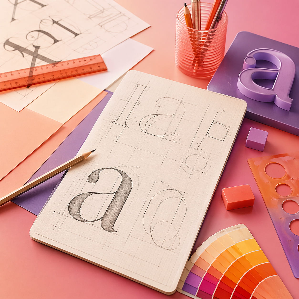
Sketch Your First Font Letters
Now it is time to create something real. Start with a pencil, pen, or tablet. Quick rough sketches are enough.
You do not need the full alphabet at the beginning. A small set gives you enough insight to move forward.
Begin With Key Characters
A smart starting set is:
- H
- O
- n
- o
- p
- a
- e
These letters help you test straight strokes, curves, and spacing. Once these feel right, building the rest of the font becomes much easier.
Keep The Style Consistent
As you sketch, look for patterns you can repeat:
- Similar curve endings
- Matching stroke thickness
- Similar corners
- A shared angle or upright feel
- Balanced width across letters
This is where your font starts to feel like a system instead of random shapes.
Turn Your Sketches Into A Digital Font
Once your sketches feel solid, move them into a digital format using vector tools or font software.
At this stage, small changes make a big difference.
Build One Letter At A Time
A practical process looks like this:
- Import or redraw your sketches
- Create uppercase and lowercase letters
- Add numbers and punctuation
- Test full words early
- Refine curves and spacing
Typing real words helps you spot issues much faster than looking at single letters.
Check Spacing Carefully
Spacing is one of the biggest factors in how your font feels.
Test simple words like:
- hand
- moon
- glass
- paper
- minimum
Look at the gaps between letters. They should feel even to your eye.
A well-spaced font combined with strong mockups can make any layout feel more polished and complete.
Test Your Font In Real Design Projects
A font can look one way in your editor and very different in actual use. Testing helps you shape it with purpose.
Try It In Different Layouts
Use your font in:
- A logo concept
- A poster headline
- A social media post
- A simple website layout
- Packaging ideas
If you often work with design resources or free design assets, place your font alongside them to see how well it blends into real projects.
For designers who like exploring free design assets alongside custom typography work, platforms like freedesignkit.com can complement the creative process.
Print And Review
Printing your font can reveal details you might miss on screen.
Look for:
- Smooth curves
- Even spacing
- Clear readability
- Consistent proportions
Finish Your Font And Make It Usable
Once your main alphabet feels stable, you can expand your font gradually.
Add punctuation, symbols, and extra characters over time. You can also build additional styles, like bold or light, later.
| Check | What To Look For |
| Consistency | Letters feel related |
| Spacing | Words read smoothly |
| Shape Quality | Clean curves and lines |
| Character Set | Includes numbers and punctuation |
| Real Use | Works in layouts |
Conclusion
Creating your own font helps you understand spacing, structure, and visual rhythm in a deeper way. It also gives you something personal that fits perfectly into your creative work, whether you are building layouts, experimenting with mockups, or putting together a full site with a WordPress theme. Start with a few letters, stay consistent, and let your font grow naturally over time.
Latest Freebies